

Handwritten Mailers vs. Digital Fonts: What Actually Feels Personal?
New Paragraph
Todays topic in the Press Box reviews a practical way for dealerships to choose real handwriting, a handwriting-style font, or standard typography without mistaking appearance for authenticity.
G4 Media’s Short Answer To Using Handwritten Mailers over Digitally Produced Ones
Real handwriting can feel more personal when the message is selective, believable, easy to read, and tied to a specific reason for contacting the recipient. A handwriting-style font can create warmth at scale, but it does not automatically communicate real human effort—and it should not imply that someone personally wrote a note when no one did. Standard typography is often the better choice for disclosures, complex offers, and information that must be scanned quickly. The right decision is therefore not “handwritten always wins.” It is: match the production method to the relationship, message, audience, and level of trust required; keep the offer truthful; and test the entire experience from envelope to landing page.
Why Does Handwriting Feel Different?
A handwritten mark carries evidence of motion, variation, and effort. That can signal that a real person chose to slow down, which is why the format is often associated with warmth and attention. Research does support that effect in some contexts, but the boundary conditions matter. A 2022 field experiment in online retail found that handwritten notes increased customer spending, while an added discount weakened the benefit. Separate experiments on product labels found that handwritten fonts can increase haptic engagement and improve evaluation in benign product categories, but not in higher-risk contexts.
Those findings do not prove that every handwritten dealership mailer will outperform every printed piece. They do explain why format and message must agree. A personal-looking note paired with an impersonal mass offer, dense fine print, or an implausible claim creates friction. The reader notices the mismatch even if the handwriting itself is attractive.

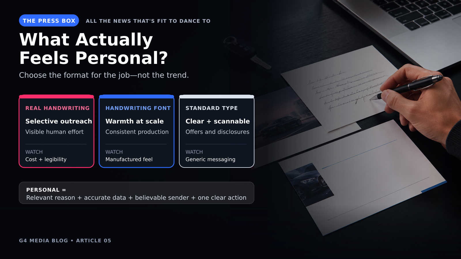
Real Handwriting, Handwriting Fonts, and Standard Type Serve Different Jobs
| Format | Best Use | Primary Advatnage | Watch-Out |
|---|---|---|---|
| Real handwriting | Selective outreach, owner notes, high-value invitations, service recovery | Visible human effort and natural variation | Cost, production time, legibility, and scale |
| Handwriting-style font | Scaled campaigns that need a warmer tone | Consistency and efficient production | Can feel manufactured if it imitates a personal note too closely |
| Standard type | Detailed offers, compliance language, schedules, and comparison content | Clarity, hierarchy, and accessibility | Can feel generic unless the message and design are specific |
Real handwriting earns its place when effort itself is part of the message. A handwritten postcard from a service manager to a recently lapsed customer can plausibly feel personal. A handwriting-style font is useful when the dealership needs warmth across a larger audience, provided the piece is presented as designed correspondence rather than a one-to-one note. Standard type is strongest when the reader needs to compare prices, dates, eligibility, vehicle details, or required disclosures without slowing down.
G4 Media’s current direct-marketing approach explicitly distinguishes its real handwritten mailers from digital-font alternatives. That is useful client-specific input, but the website’s performance language should be treated as G4’s experience and positioning—not as an independent universal benchmark.
What Actually Makes a Mailer Feel Personal?
- Start with a recognizable reason for contact. Reference a service interval, ownership milestone, relevant inventory need, event, or dealership relationship that the recipient can understand.
- Use only personalization the dealership can support. A correct first name and vehicle can build relevance. A wrong vehicle, outdated owner, or duplicated household destroys it.
- Make the sender believable. Identify the role or team behind the message. If the note is not individually written, avoid language that pretends it was.
- Give the recipient one clear next action. Use a trackable phone number, QR code, PURL, appointment link, or reply path that matches the promise.
- Carry the same experience into digital. The landing page, email follow-up, social supplement, and BDC response should recognize the same offer and message.
- Respect the reader’s time. Keep the core message short. Put necessary terms where they can be read without turning the entire piece into fine print.
How Should a Dealership Test the Difference?
Test the complete campaign, not only the font. Hold the audience, offer, timing, mail class, list source, response path, and follow-up process as constant as practical. Change one meaningful variable: real handwriting versus a handwriting-style font, or handwriting-style versus standard typography. Use unique response routes and reconcile responses to appointments, shows, repair orders, or sales where permitted.
Do not call a winner from opens or scans alone. A mailer can attract curiosity without producing qualified action. Measure delivered pieces, digital interactions, valid responses, appointments, kept appointments, completed transactions, opt-outs, complaints, and cost per useful outcome. Small samples can swing dramatically, so repeat the test before making a long-term production decision.
USPS Informed Delivery gives mailers a way to pair a physical piece with synchronized digital content and additional measurement. G4 can also connect direct mail with targeted digital media and a documented response path so the format decision is evaluated inside the whole journey.
Risks and Limits
- Unreadable handwriting is not personal; it is friction. Review names, numbers, disclosures, and calls to action at actual print size.
- A handwriting font should not be used to imply a personal act that did not occur. The FTC applies truth-in-advertising standards to mail as well as digital media.
- Personalization depends on data quality. Suppress deceased owners, sold vehicles, duplicate households, opt-outs, and records without a valid reason for contact.
- Incentives can overwhelm the relational signal. The offer still needs sound economics, clear eligibility, and truthful terms.
- A strong mailpiece cannot repair a broken landing page, unanswered phone, or inconsistent BDC script.
How G4 Media Can Help
G4 Media’s direct marketing services include real handwritten formats, service, buyback, equity, credit-card, and high-traffic campaign concepts, plus PURLs, QR codes, landing pages, and response support. The valuable question is not simply which sample looks most personal. It is which format, list, offer, and follow-up sequence make sense for the dealership’s objective.
Ask G4 to build a controlled mail-format test with one defined audience, one response path, and an approval plan for the offer, data, creative, and follow-up process.
Frequently Asked Questions
Is real handwriting always better than a handwriting font?
No. Real handwriting is strongest when visible effort matters and the audience is selective. A handwriting-style font may be more practical at scale, while standard type is often better for clarity and compliance.
Can a digital font still feel personal?
Yes, if the message, data, offer, sender, and response experience are genuinely relevant. The font can support warmth; it cannot create authenticity by itself.
What should we test first?
Start with one audience and one offer. Test only the production style, then compare qualified responses and completed outcomes—not just scans or clicks.
How do we keep the campaign measurable?
Use campaign-specific numbers or URLs, consistent source codes, and CRM dispositions that connect the mailpiece to later appointments or transactions.
What should never be personalized?
Do not use sensitive, stale, inferred, or legally restricted information merely because it is available. Use only data the dealership is entitled to use and can keep accurate.
Sources
- G4 Media: Comprehensive Direct Marketing Solutions — Client-specific service and positioning source.
- USPS PostalPro: Informed Delivery for Business Mailers — Official physical-and-digital mail integration guidance.
- Kim, Choi & Kim: Do Handwritten Notes Benefit Online Retailers? — Randomized field experiment with stated boundary conditions.
- Izadi & Patrick: The Power of the Pen — Original experiments on handwritten fonts and haptic engagement.
- FTC: Advertising FAQs for Small Business — Official truth-in-advertising and substantiation guidance.